Hypermaremma
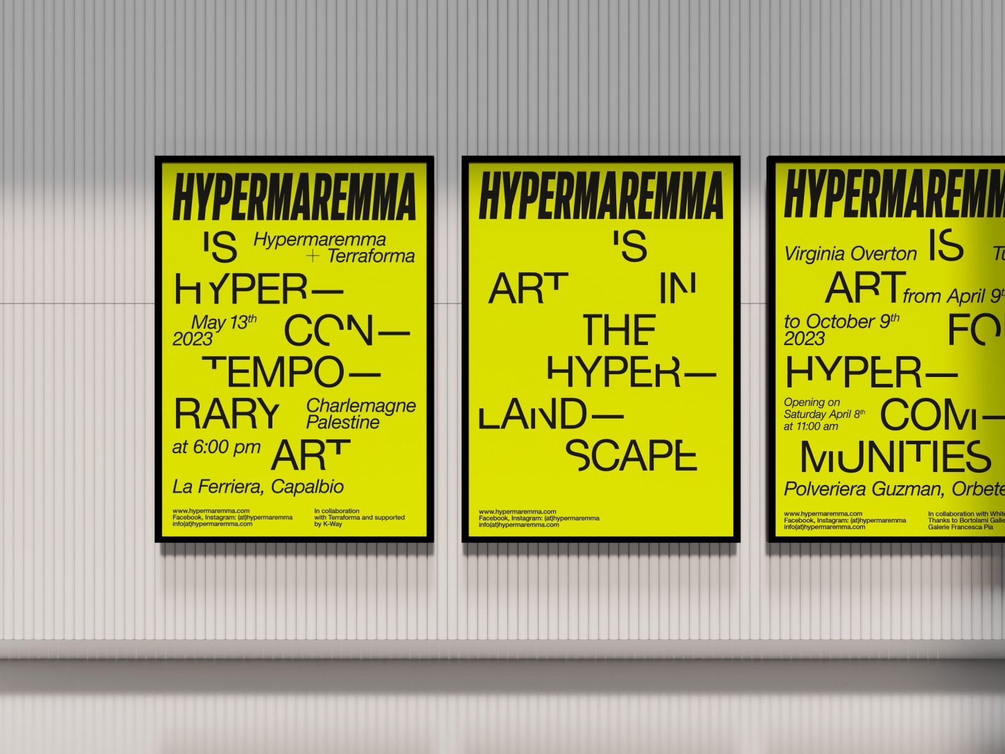
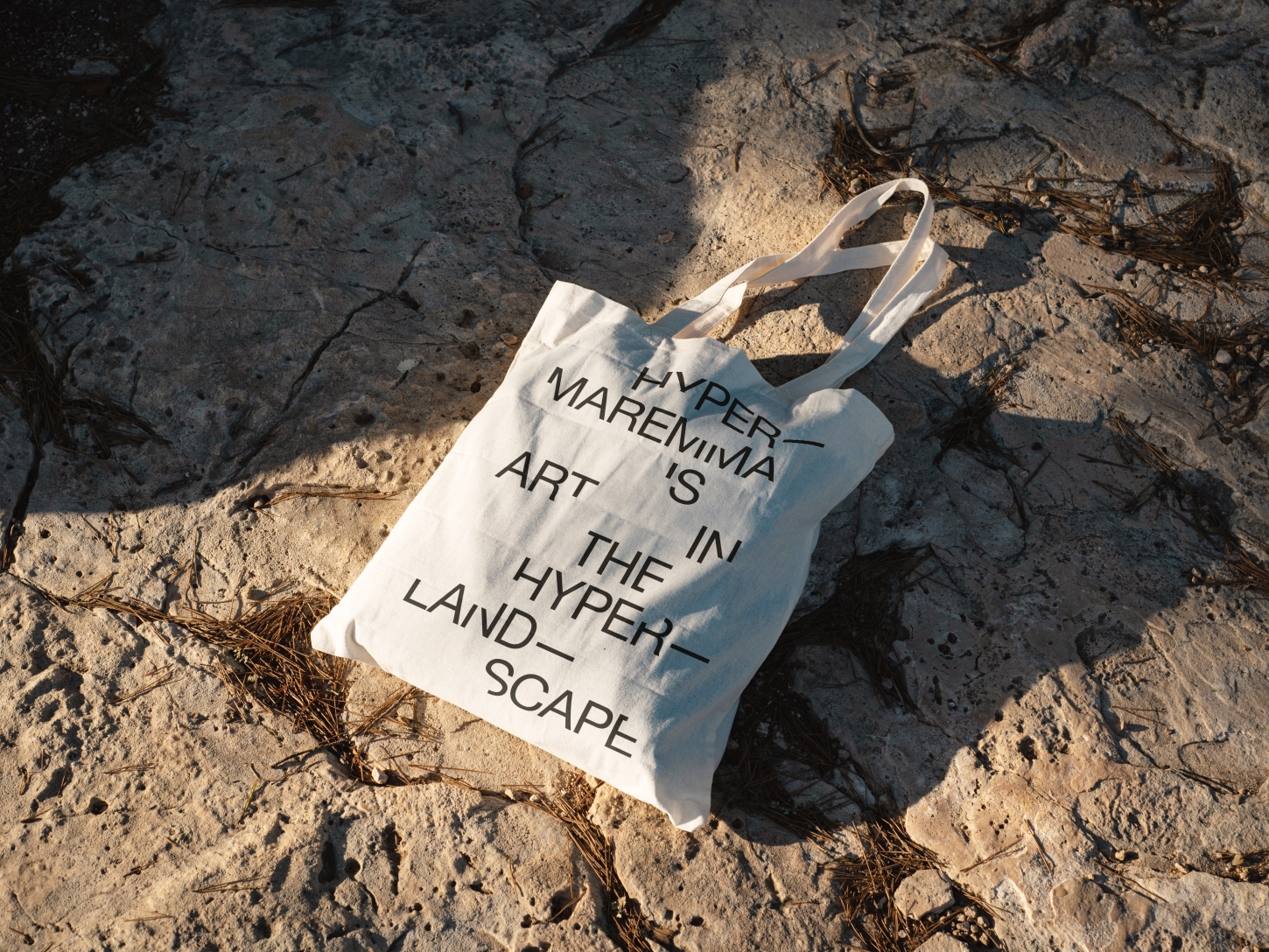
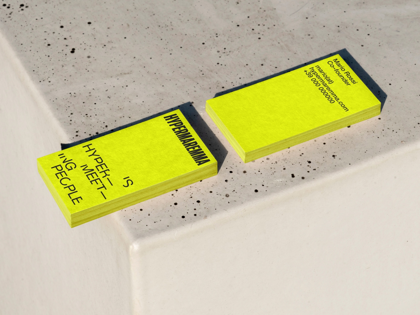
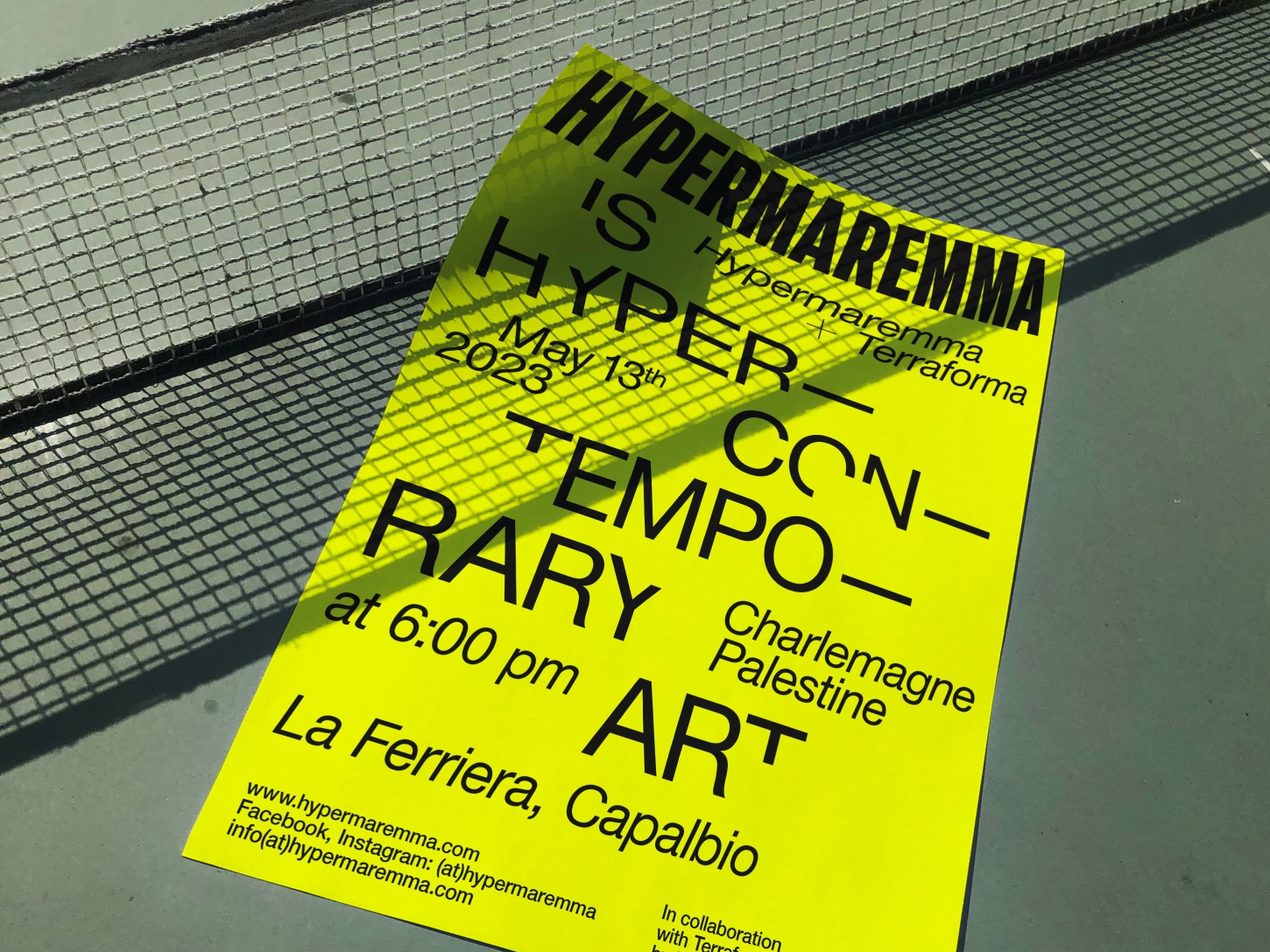
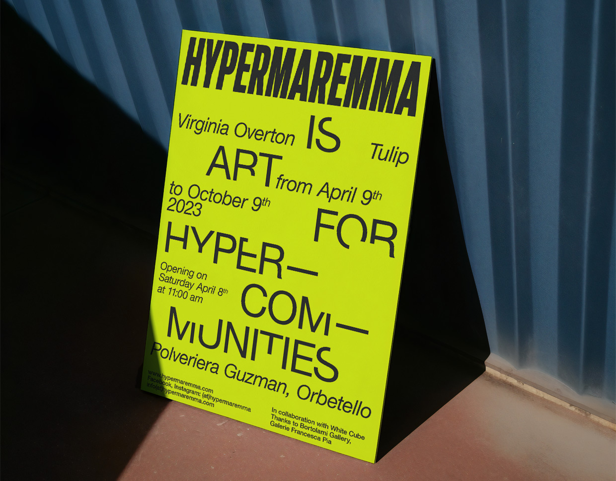
BRH+ completes the rebranding of Hypermaremma, the festival that, through a constellation of artistic and musical interventions, engages with the iconic places of the Maremma territory.The new visual identity preserves the original logotype and colors, now combined with essential, hypercontemporary lettering that is deliberately left incomplete. A series of phrases designed for the occasion, in a highly recognizable graphic composition, define the scope of its activities. The design of the individual letters structuring the words, in its unfinished nature, urges attention and requires greater concentration in reading, underlying the desire for sharing and collaboration that marks the entire project.
BRH+ completes the rebranding of Hypermaremma, the festival that, through a constellation of artistic and musical interventions, engages with the iconic places of the Maremma territory.The new visual identity preserves the original logotype and colors, now combined with essential, hypercontemporary lettering that is deliberately left incomplete. A series of phrases designed for the occasion, in a highly recognizable graphic composition, define the scope of its activities. The design of the individual letters structuring the words, in its unfinished nature, urges attention and requires greater concentration in reading, underlying the desire for sharing and collaboration that marks the entire project.