
MMOOS.
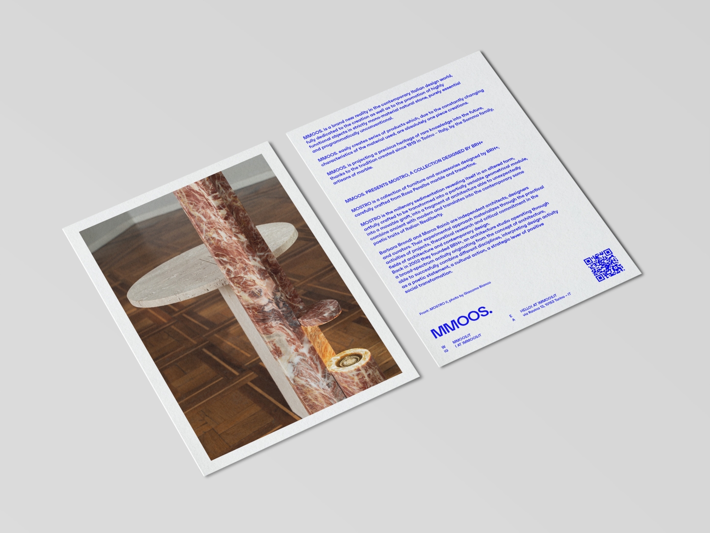
Leading MMOOS.’s art direction, BRH+ shapes a clear and distinctive vision for the brand’s launch into the contemporary design scene. The work encompasses the entire process of defining the brand identity, from the construction of the visual language to the product strategy and the development of its iconographic apparatus.
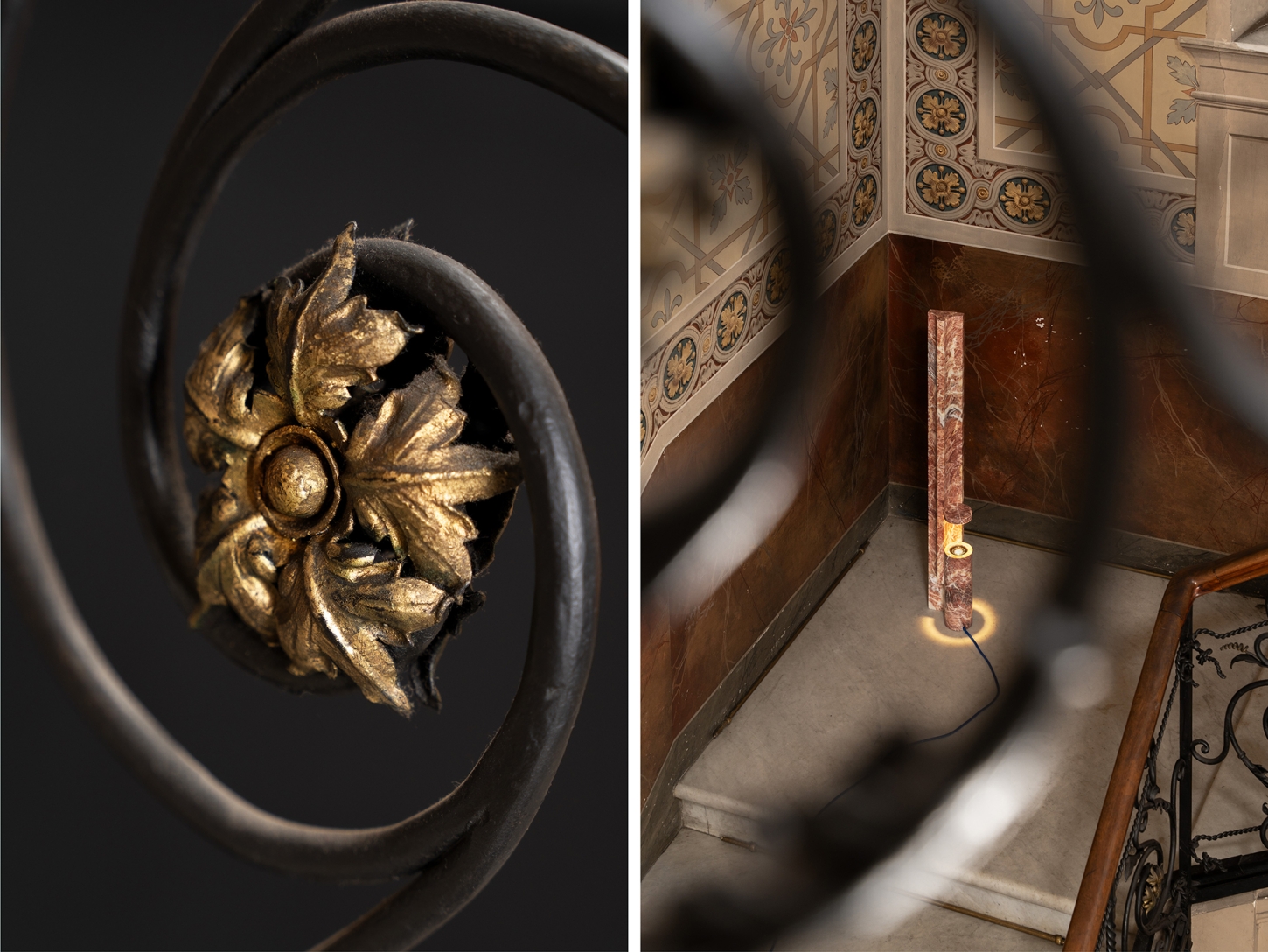
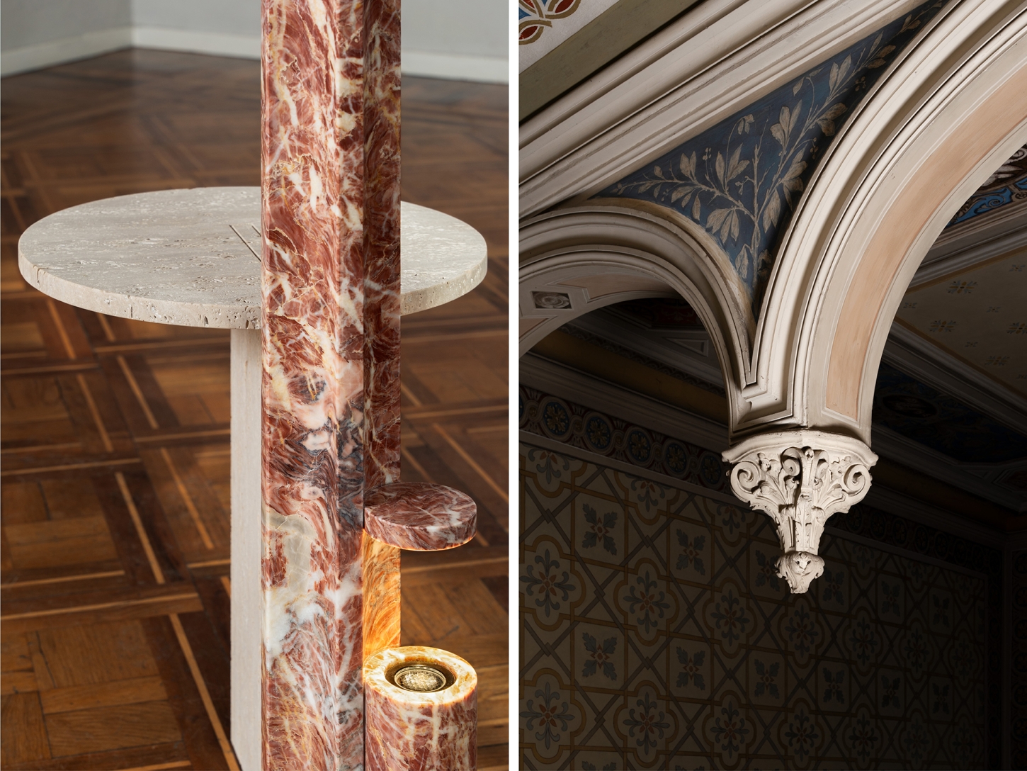
The starting point is the development of a visual identity with a bold and essential character, reflecting the positioning of MMOOS. as an experimental and culturally sensitive reality. The colors are reduced to a minimal palette defining an unconventional visual direction, conveying a strong identity capable of standing out in the research design scene.
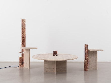
Underlying the project is also a deep reflection on materials and production. BRH+ defines in this sense a clear product strategy, oriented to the realization of highly functional objects in strictly mono-material natural stone, marble, and travertine, purely essential and programmatically unconventional.
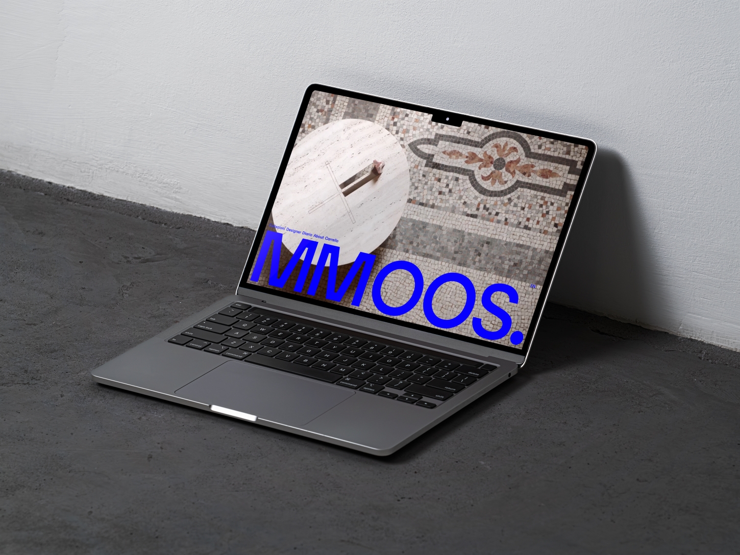
To the completion of the creative process, BRH+ takes care of the production of the brand’s communicative devices, directing the creation of the photographic and visual content that renders, with consistency and impact, the universe of MMOOS. while enhancing its cultural vision and experimental approach.
The result is a powerful visual identity, supported by solid design thinking capable of combining concept, aesthetics and strategy in an original and recognizable synthesis.
Photography: Giacomo Bianco
Leading MMOOS.’s art direction, BRH+ shapes a clear and distinctive vision for the brand’s launch into the contemporary design scene. The work encompasses the entire process of defining the brand identity, from the construction of the visual language to the product strategy and the development of its iconographic apparatus.
The starting point is the development of a visual identity with a bold and essential character, reflecting the positioning of MMOOS. as an experimental and culturally sensitive reality. The colors are reduced to a minimal palette defining an unconventional visual direction, conveying a strong identity capable of standing out in the research design scene.
Underlying the project is also a deep reflection on materials and production. BRH+ defines in this sense a clear product strategy, oriented to the realization of highly functional objects in strictly mono-material natural stone, marble, and travertine, purely essential and programmatically unconventional.
To the completion of the creative process, BRH+ takes care of the production of the brand’s communicative devices, directing the creation of the photographic and visual content that renders, with consistency and impact, the universe of MMOOS. while enhancing its cultural vision and experimental approach.
The result is a powerful visual identity, supported by solid design thinking capable of combining concept, aesthetics and strategy in an original and recognizable synthesis.
Photography: Giacomo Bianco