
MMOOS.
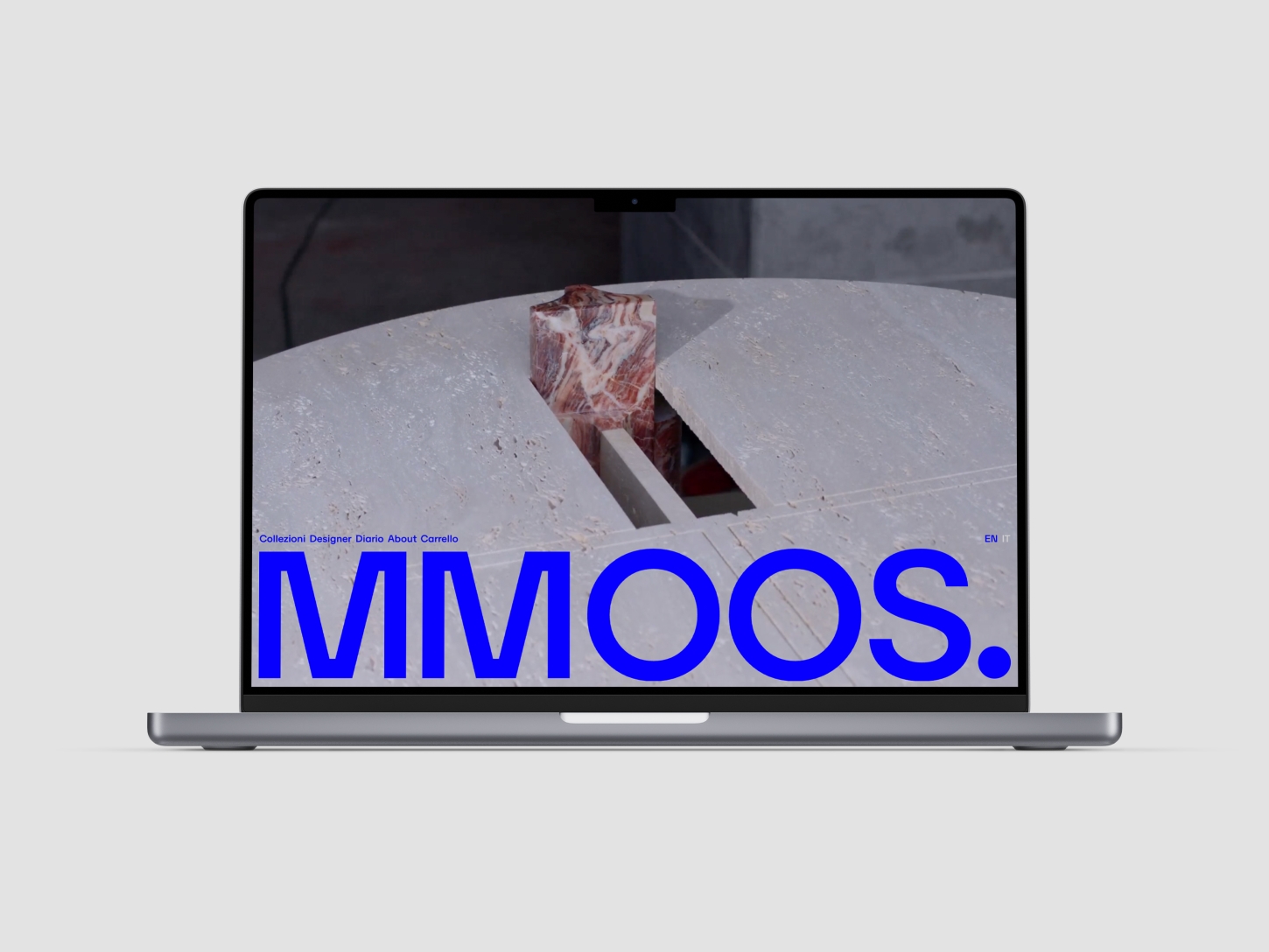
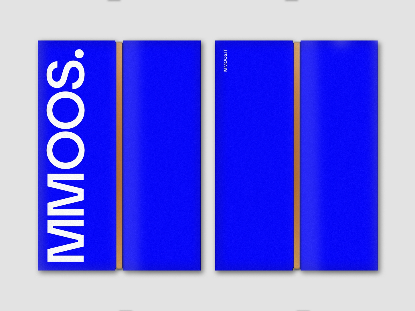
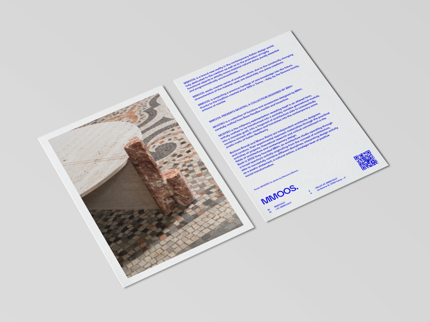
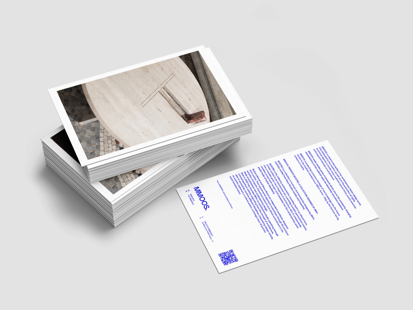
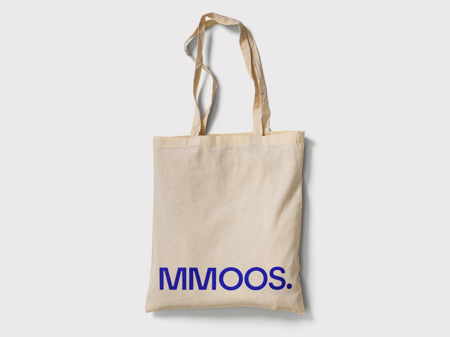
The visual identity odeveloped by BRH+ for MMOOS. reflects the bold and unconventional character of this new reality in contemporary design. The brand image is essential but powerful, built on a stark, minimal visual language rich in formal tension. The color choices reduced to an essential primary blue in sharp contrast with optical white, together with a rigorous typography, define a communication system capable of conveying both design precision and experimental attitude.
The visual tone is edgy but never forced, naturally communicating the brand’s hybrid, radical and research-oriented character. The identity of MMOOS. thus becomes a cultural positioning tool, a minimal visual grammar capable of translating the brand’s values and dialoguing with an attentive and international audience.
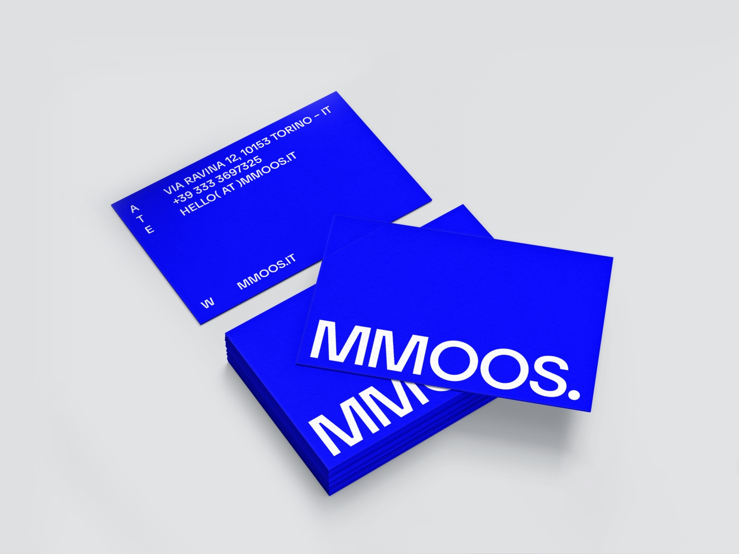